Buttons
Our button component in the Sunbird-Ed portal utilizes the sb-btn class as the default style. It's versatile, with variations available in primary, secondary, warning, error, and gray colors, each represented by specific classes like sb-btn-primary, sb-btn-secondary, and others.

Outline Button Variation:
We offer an outline button variation to provide a different visual style. These are denoted by classes like sb-btn-outline-primary, sb-btn-outline-secondary and others.

Size Variations:
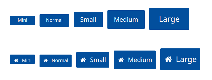
Our button component supports various sizes to cater to different layout requirements. These sizes are represented by classes such as sb-btn-xs, sb-btn-normal, sb-btn-sm, sb-btn-md, and sb-btn-large.

Theme Variations
Incorporating the Joy theme, we've made specific modifications to the button component to align with its vibrant and engaging visual style.

Example of how to use classes for buttons
For more information please refer to this link: https://sunbird-ed.github.io/sunbird-style-guide/dist/#/buttons