> For the complete documentation index, see [llms.txt](https://ed.sunbird.org/llms.txt). Markdown versions of documentation pages are available by appending `.md` to page URLs; this page is available as [Markdown](https://ed.sunbird.org/release-6.0.0/use/source-code/ui-user-interface-sunbird-ed-portal/angular-material/components-usage.md).
# Components Usage
To use Angular Material components in your Angular application, follow these general steps:
1. **Import the Required Angular Material Modules**: In your Angular module file (e.g., `app.module.ts`), import the Angular Material modules that correspond to the components you want to use. For example, if you want to use **buttons** and **card**, you would import the **`MatButtonModule`** and **`MatCardModule`** modules.
{% code lineNumbers="true" %}
```javascript
import { MatCardModule } from '@angular/material/card';
import { MatButtonModule } from '@angular/material/button';
// Import other required modules as needed
```
{% endcode %}
2. **Add the Imported Modules to the `imports` Array**: Inside the **`@NgModule`** decorator in your module file, add the imported Angular Material modules to the **`imports`** array.
{% code lineNumbers="true" %}
```javascript
@NgModule({
declarations: [
// Your components
],
imports: [
MatCardModule,
MatButtonModule,
// Add other imported modules here
],
providers: [],
})
export class AppModule {}
```
{% endcode %}
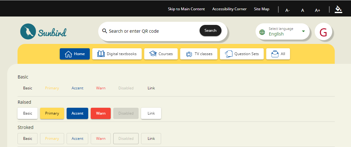
3. **Use Angular Material Components in Your Templates**: In your component templates (HTML files), you can now use Angular Material components by adding the appropriate HTML elements and attributes. For example, to use a button, you can write:
{% code lineNumbers="true" %}
```html
```
{% endcode %}
The expected output is as follows:
For more information about buttons, please visit the following link:
[**https://v14.material.angular.io/components/button/overview**](https://v14.material.angular.io/components/button/overview)
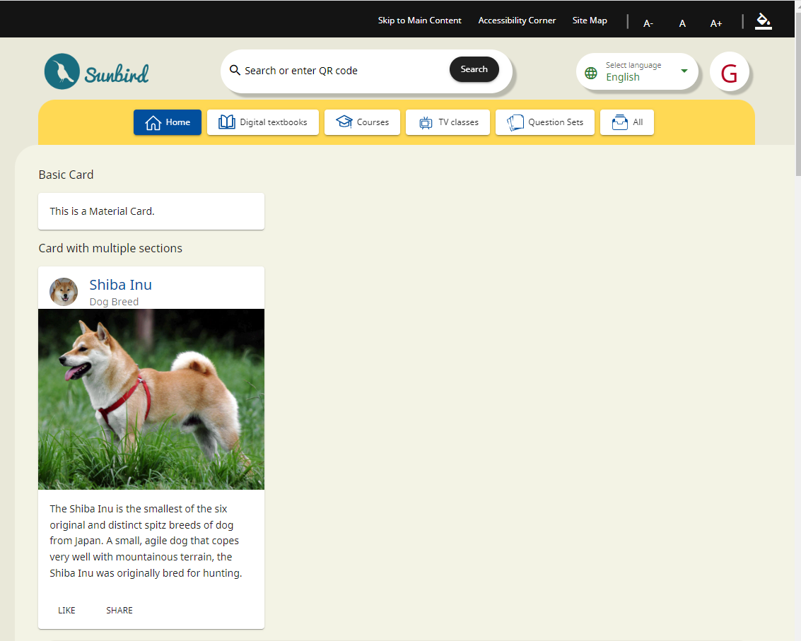
**And to use a card:**
{% code overflow="wrap" lineNumbers="true" %}
```html
//Basic card
This is a Material Card.
//Card with multiple sections
Shiba InuDog Breed
The Shiba Inu is the smallest of the six original and distinct spitz breeds
of dog from Japan. A small, agile dog that copes very well with mountainous
terrain, the Shiba Inu was originally bred for hunting.
```
{% endcode %}
The expected output is as follows:
For more information about **cards**, please visit the following link:
[**https://v14.material.angular.io/components/card/overview**](https://v14.material.angular.io/components/card/overview)
### Customize and Style
To personalize and style Angular Material components within your Angular application, you have various techniques at your disposal. These include CSS, Angular Material theming, and component-specific customization options, which will be elaborated on in the upcoming sections.
### Additional Configuration
Adding Angular Material components to your application is a straightforward process, as you can easily include them in your templates. Be aware that for specific components, you may need to import additional modules and styles. For a comprehensive guide on using each component and understanding their dependencies, kindly refer to the following link.
[**https://v14.material.angular.io/components/categories**](https://v14.material.angular.io/components/categories)
---
# Agent Instructions
This documentation is published with GitBook. GitBook is the documentation platform designed so that both humans and AI agents can read, navigate, and reason over technical content effectively. Learn more at gitbook.com.
## Querying This Documentation
If you need additional information that is not directly available in this page, you can query the documentation by asking a question.
Perform an HTTP GET request on the following URL with the `ask` and `goal` query parameters:
```
GET https://ed.sunbird.org/release-6.0.0/use/source-code/ui-user-interface-sunbird-ed-portal/angular-material/components-usage.md?ask=&goal=
```
`ask` is the immediate question: it should be specific, self-contained, and written in natural language.
`goal` is what the user is ultimately trying to achieve, the reason they need the answer. Sharing it helps GitBook give you a better, more relevant answer. A goal is most helpful when it describes the outcome the user wants rather than restating the question. For example, with `ask=how do I create an API token`, a goal like `automate deployments from our CI pipeline` lets GitBook tailor the answer to that use case.
The response will contain a direct answer to the question and relevant excerpts and sources from the documentation.
Use this mechanism when the answer is not explicitly present in the current page, you need clarification or additional context, or you want to retrieve related documentation sections.